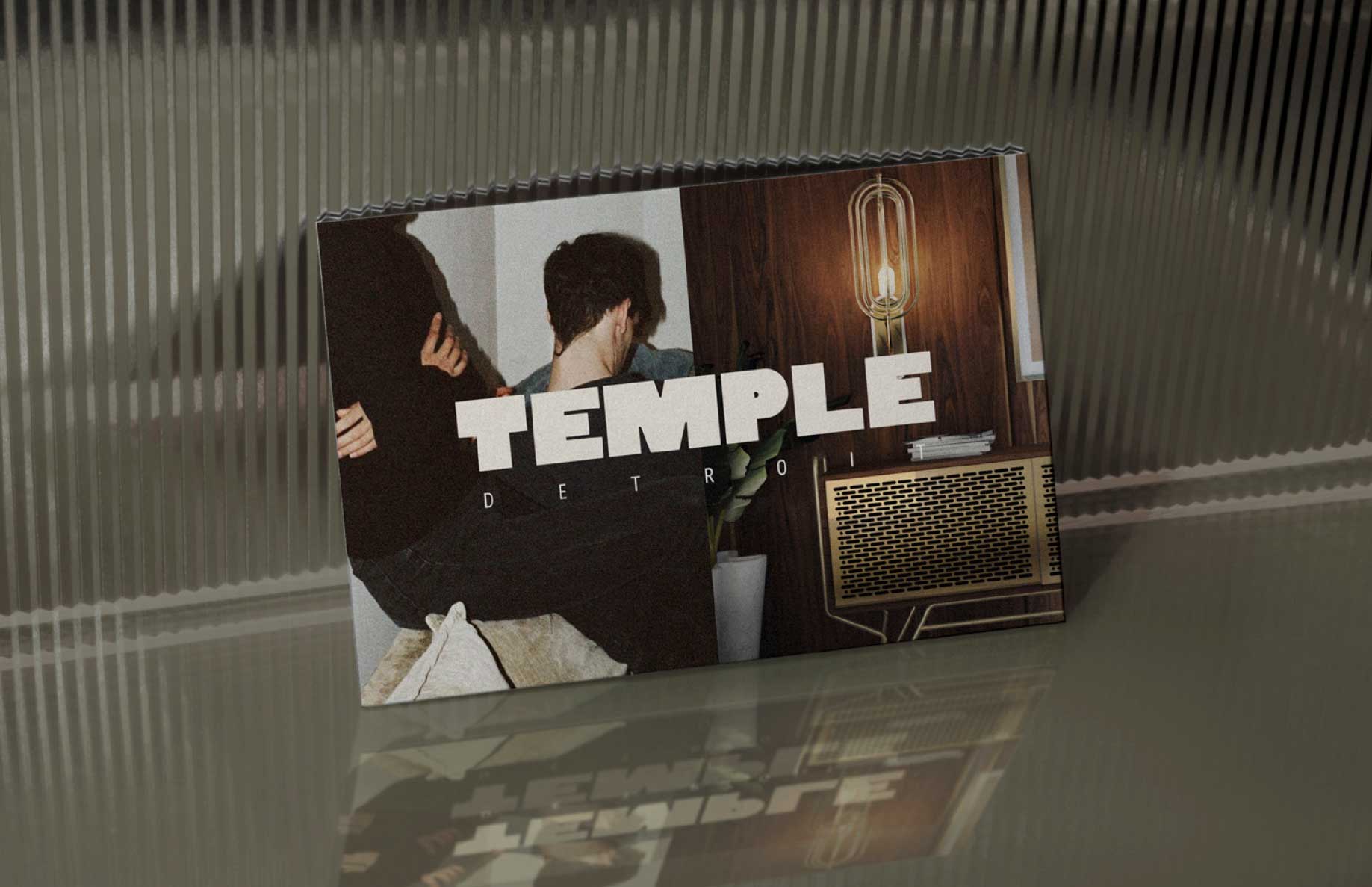
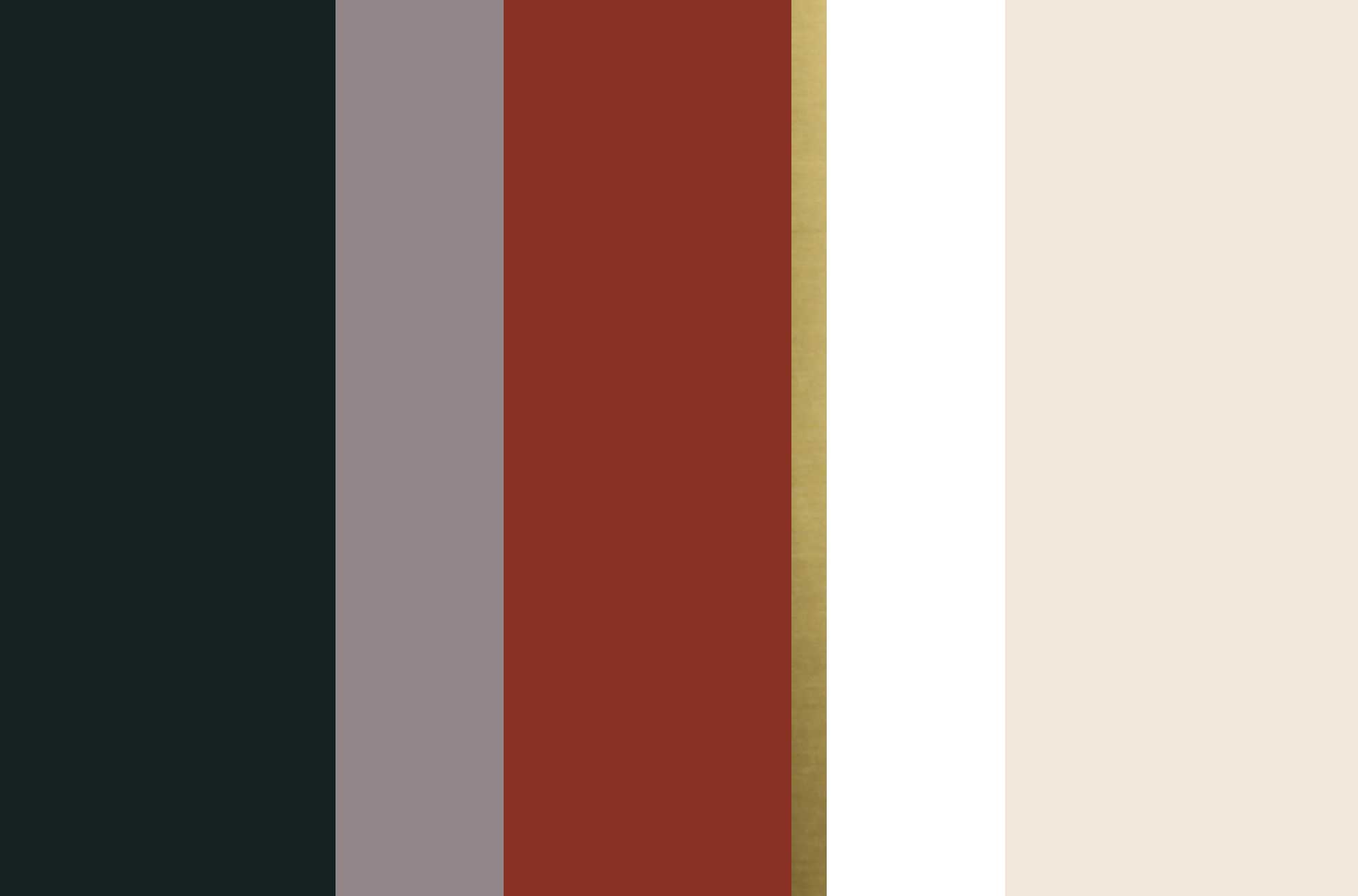
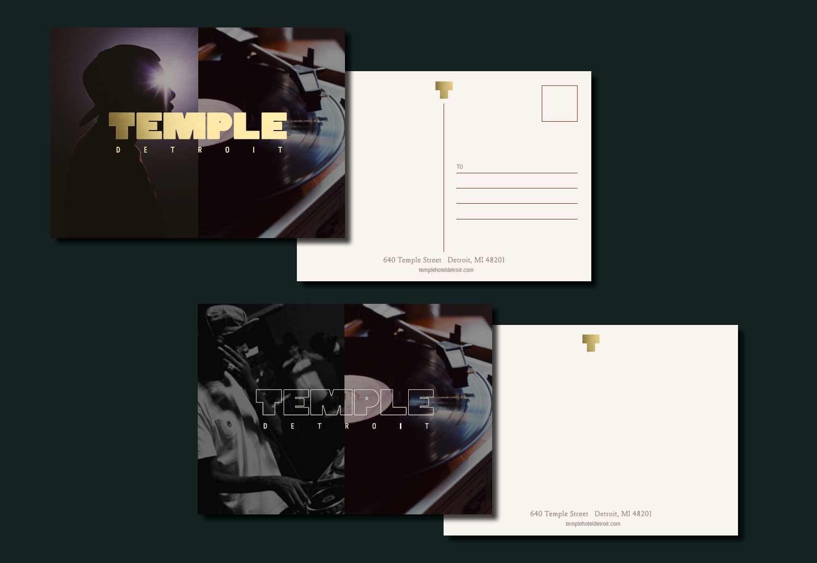
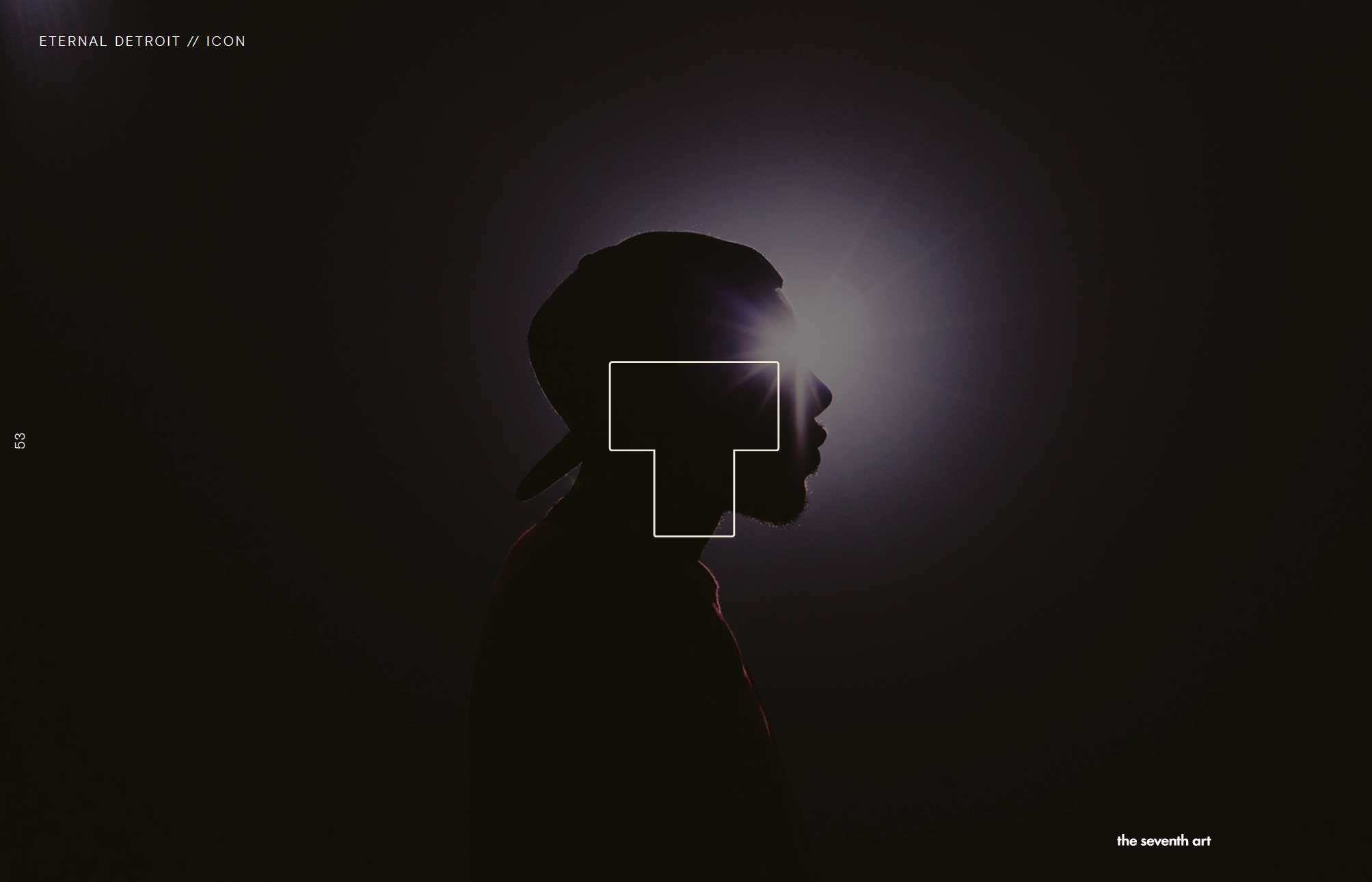
Branding done for Lenny Kravitz Studio. Great synergy between two creative studios. Here the brand look and feel maintains the curated cool established in the Interior Design Direction but goes even further to establish a narrative through juxtaposing two images next to each other. Here, past and present, still life and portrait, art and architecture, music & lifestyle are contrasted with each other to tell a cohesive Temple Detroit story.
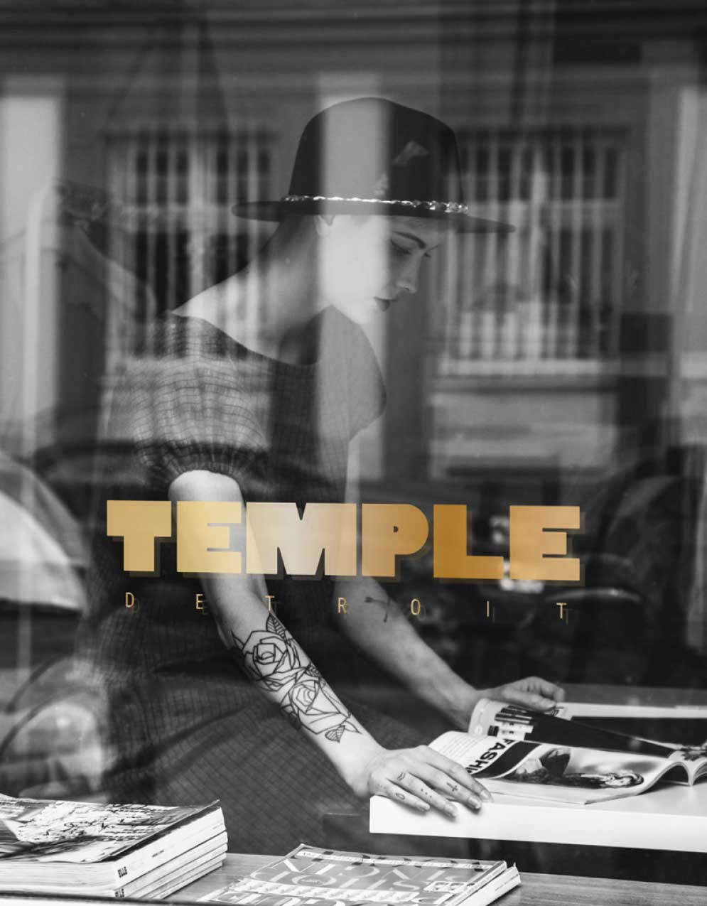
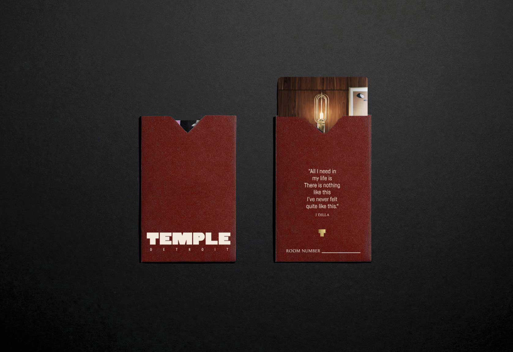
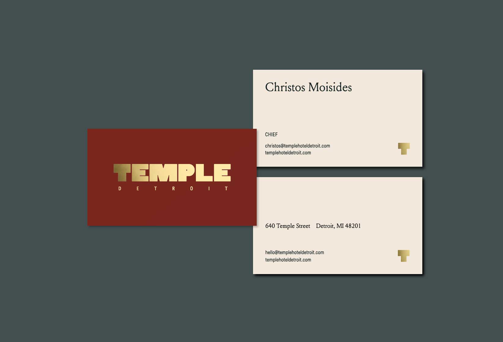
The graphics for Temple Detroit are edgy and bold as well as sophisticated and refined. Graphics inspired by artists like Frank Stella, layered circular motifs, emblems, and luxurious print treatments like gold foil speak a visual language of soul and allure. The typography for Temple Detroit is bold while also feeling feminine. Expressive yet refined. Referential and retro yet contemporary. Undeniably cool and timeless, the typography should balance out the brand while also being a dominant graphic element.

